Next time you pick up a bag of Lay’s potato chips, take a closer look at the bright yellow logo. What appears to be a simple, cheerful design actually contains a subtle detail that many fans overlook—one that hints at the brand’s history and connection to Frito-Lay.
A Logo Everyone Recognizes
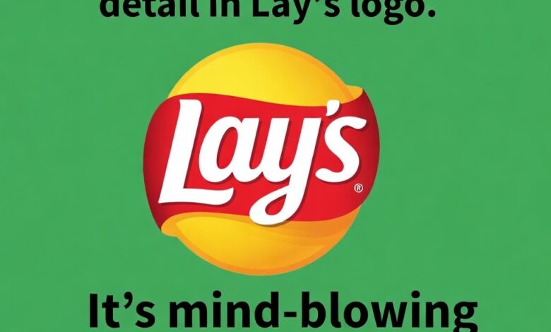
The Lay’s logo features a sunny yellow circle, bold white lettering, and a sweeping red ribbon. Its colors and curves convey fun, energy, and approachability—perfect for a snack brand that has been part of households for nearly a century.
A Subtle Nod to Its Origins
Look closely, and the circular backdrop and ribbon subtly reference Frito-Lay, the parent company. This design choice honors the brand’s origins while keeping the logo modern and friendly. While most consumers may never notice it, the detail quietly links every bag of chips to the larger snack legacy that began decades ago.